For my last computer science class, I took a course on UI Design. Each semester, the course staff decided on a platform that students then have to use in their semester projects. For my semester, we were required to use Amazon’s Alexa platform to create an application that included some voice interaction.
Within my group, we divided roles so that we had one designer, two engineers, and one user researcher (me). These roles became less and less defined as we developed our app through the semester, and in the end, we were all designing and coding.
Ideation
The project started with ideation. The requirements for the project were pretty sparse, so we were free to choose almost anything we wanted to work on. To test voice interaction, we had Fire Tablets, but the application could have been either a web or mobile app. We had a brainstorming session (à la IDEO), and generated about 50 ideas, that we grouped into larger categories such as ‘academic’, ‘fitness’, and ‘food’. In the end, we chose the ‘food’ category, and wanted to make a recipe app that guides users through recipes.
Unfortunately for us, this exact idea was the next homework assignment to familiarize us to AWS and voice technology. We had to come up with a new idea for our project and returned to the ideas that we had generated earlier. While we wanted to stay in the food category, we realized that recipe and cooking aid apps were fairly common, and if we were to stay in this space, we would have to address some other aspect of food production. Inspired by my other teammates, who all worked at a tea shop near campus, we modified our idea to move from recipe instruction to restaurant management. Sous Chef was born!
Problem Space and MVP
Through this app, we were trying to address two major concerns in restaurant kitchens: sanitary conditions and efficiency. Many kitchens still use paper receipts, and chefs end up touching paper, printers, and bells to mark the beginning and end of an order. Through voice capabilities, we wanted to minimize chefs’ contact with anything that wasn’t food – taking advantage of the hands-free quality of voice technology.
This tied into our second goal of increasing efficiency, as it would cut down the time chefs spent washing their hands before returning to preparing food. Additionally, we wanted to cut down the time spent on individual orders by including a way to look across orders to find redundancies. One complaint that my teammates had about their experience at the tea shop was that after every order, the blenders and utensils needed to be washed. Because they didn’t have a good way of seeing all the orders coming in, they would end up making the same drink multiple times (and washing dishes in between) if several customers wanted it.
We translated these issues into the three main capabilities of our desired minimum viable product:
- Display orders on the GUI as they come in
- Start and finish orders through either touch or voice interaction
- Display a summary of orders in the queue through voice command
User Research
Once we had our goals decided, the rest of the semester was spent researching, developing, testing, and redesigning our idea. We began with a competitive analysis and interviews with target users to identify specific pain points in how restaurants currently manage orders. Our competitive analysis showed that the many apps related to food or restaurants centered around recipes, or finance and business management. There were no apps meant to address order management, so we were happy that our project was still a novel idea in a fairly app-saturated industry.
For our interviews, we asked 3 restaurant cooks about their experiences in the kitchen. We began with more general questions such as what they liked and disliked about their job, and eventually honed in on the ordering process, with questions such as “How do you feel about your current system of receiving orders from the cashier and signaling that orders have been completed?” Because we were in the early stage of this project, we wanted to encompass the whole ordering process and its issues, rather than going into the specifics of what we planned on including in Sous Chef.
We took our findings from our interviews, and condensed them into a list.
Top 5 User Needs:
- Being able to group the same orders together quickly to make batches of food rather than individual orders.
- Being able to quickly notice which item is next in the queue or which items is already made
- Being reminded of orders if forgotten
- Being able to quickly filter a list of orders, and see everything in the queue
- Being able to be immediately notified of the newest order without interrupting their current work
Generally, our interviews with target users reiterated the inefficiency of using paper receipts, but also brought to light another issue we had not initially considered: language barriers. Many restaurant cooks that come from other cultures have a hard time communicating with their co-workers, so having an app that only needs simple english commands to show orders and their status can help smooth the cooking and delivery process.
Iteration 1
We combined these user needs and our own project goals to come up with wireframes and prototypes. Our subsequent class assignments were to iterate over these designs for multiple weeks until final presentations. When designing our very low-fi drawing, we decided that we wanted to simulate the current organization of restaurant slips lined up in a kitchen, to make the transition from paper to virtual orders easier for our users. We chose a horizontal design, with small squares with order numbers and items. We used Figma to produce a prototype and make changes.


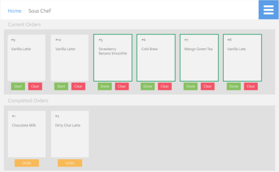
This first version of Sous Chef’s design allowed users to start an order, mark it as complete, undo those changes, request a queue summary, and see what orders they had already completed. A new order would appear in the “Current Orders” list. To start any of the orders, users would click on the “Start” button or say, “Start order number …”. The corresponding slip would then move to the front of the list and be highlighted with a blue outline. To see what orders had not been started yet, users could say, “show me the queue summary” or simply, “queue summary”. To complete an order, they could either click the “complete” button under the order’s slip or say, “Complete order number …”. The slip would then move down to the “Last Completed” list.
The engineers on our team started to code for VUI, while I conducted usability tests with two friends that had worked in restaurants before. During the usability test, I asked them to complete three tasks: start an order, request an queue summary, and complete the order. To simulate the app’s functionality, I created multiple frames that I showed users as they tapped and spoke the various commands. After giving them the chance to become familiar with the prototype and completing the three tasks, I asked them a few final questions to get their feedback on the design and presentation.
Of the three tasks, requesting the queue summary was the most difficult for both users. Even though I told them that they could use either voice or touch to complete their tasks, they generally opted for touch, as they were more familiar with that type of interaction. Because the queue summary can only be requested through voice, they thought having to say something in the middle of tapping buttons was awkward and it felt strange talking to such a low fidelity prototype. However, in the interviews, they mentioned that in a restaurant kitchen, such voice capabilities would be very useful and cooks could really get used to it. In terms of design, the two users gave some contradictory feedback. While one user liked the colors and how orders were organized in the queue, the other felt that the colors and how we denoted orders that were being prepared could be changed.
Iteration 2
We integrated their feedback into our next iteration, which was a functional web app. This version had adjusted colors and design, and a working VUI. We also added confirmations for deleting orders and “close” buttons to exit from pop ups such as these confirmations or the queue summaries.

To test this version, we had expert reviews in class where we presented our project to two other groups. During these expert reviews, we first explained our apps and its various features, and then they explored the apps themselves and gave feedback. We received positive feedback on the simplicity of the app, as we had all our functionality was folded into one screen. They also complimented the idea itself, and felt that it was actually solving a problem outside of the classroom. Most of the suggestions we received were focused on specific design aspects: reviewers suggested that we remove many of the buttons to declutter the presentation, and move the notifications to the side to not block the orders. They also recommended making the “Completed Order” bar collapsable, to clear the space further. Other reviewers brought up the fact that we had not developed any way to place orders, and that in the end, we would also need a UI that faced diners or cashiers.
Iteration 3
We took these recommendations and produced the last iteration of Sous Chef, which we demonstrated at our class showcase at the end of the semester. To address the issue of placing orders, we created a basic input screen to where diners could input their order. These were then uploaded to a database that our main page pulled from to display orders. Whenever the cook changed the order’s status to “in progress” and then “complete”, the database updated as well. This addition made demoing easier as well, and audience members could add their own orders to the queue, and see it move from start to finish. When developing this last version, we went back to our three goals and five user needs to see if Sous Chef addressed those requirements. Our final app did display all orders at once with status updates, included touch and voice interaction, showed a summary of all orders coming in to address redundancies, and gave notifications that did not disrupt current work — we had accomplished exactly what we had intended.


