College of Computing Website Redesign
Lead Researcher · partnered with GT's College of Computing
Georgia Tech's College of Computing shipped this work — they adopted our research findings and design recommendations in their website overhaul. See the impact of our work on their official website: www.cc.gatech.edu
In my first semester at Georgia Tech, I was Lead Researcher on a semester-long group project for my UX research methods course, done in collaboration with an external partner — Georgia Tech's College of Computing, which wanted to completely overhaul their website.
The College had the resources to build a new site programmatically, but no research on the needs and behaviors of students, faculty, or industry partners. Our job was to provide both in-depth research and design ideas they could implement. They asked us to focus on students — current and prospective: with more than 12,000 enrolled students and nearly as many applicants each year, there was a chance to make a positive impact at real scale.
In our first conversation, the College named what they felt were the biggest issues. We then validated and sized those concerns through research, and designed a four-month plan aligned with class deadlines. As Lead Researcher I delegated lighter activities and personally led the survey and card-sorting work.
Research
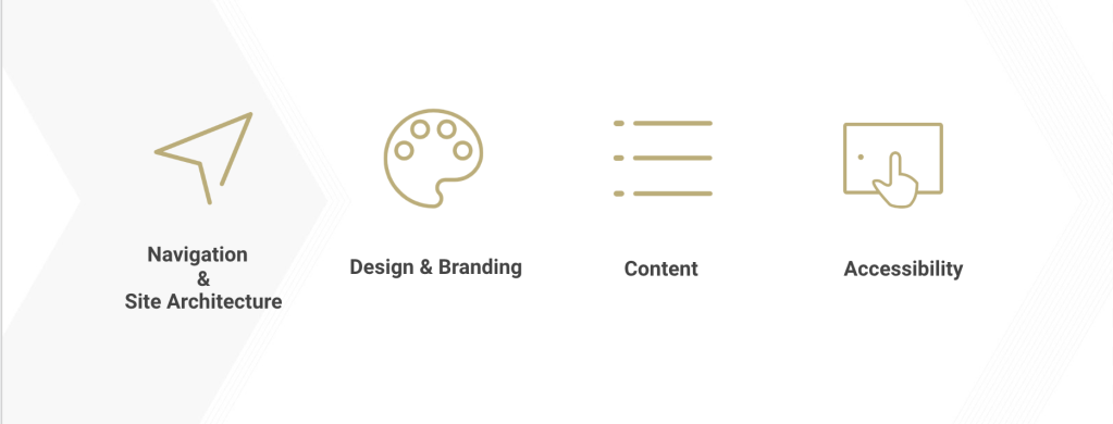
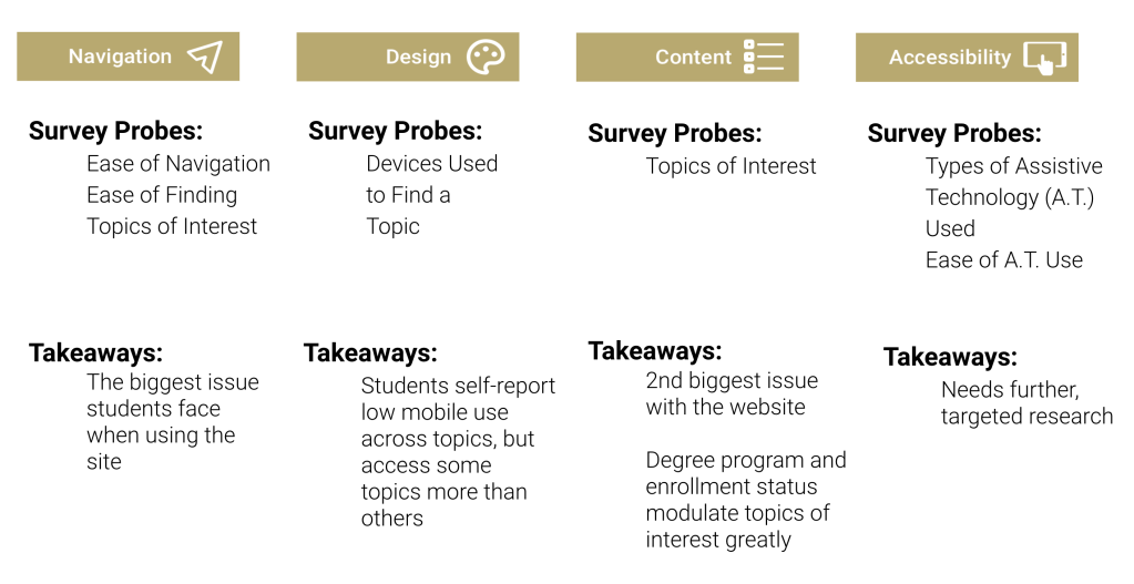
Our objectives were validation — were the four areas of focus the real issues? — and sizing — how major were the concerns within each, and what should we prioritize?
- Navigation was the #1 problem on the website
- Content was the #2 problem on the website
- Tenure at Georgia Tech, degree program, and mobile use modulate which pages students access
- The current site is non-responsive and very inaccessible
I · Stakeholder interviews
We ran unstructured interviews with members of the administration and an accessibility expert. The administration focused on poor navigation and content strategy; the accessibility expert highlighted tools and considerations to carry into the design phase.
"The website lacks clear navigation to useful resources for students. I would like a single place I can point students to."
"Truly accessible websites require usability and programmatic testing."
II · Survey
This survey was my personal baby — I love designing surveys in Qualtrics. I probed all four themes and collected data directly from the student body, with a Communications team member helping distribute it. I gathered 195 viable responses across degree programs and tenures. First-year students were routed to a separate block answering the same questions in the context of their application ("When you were applying to Georgia Tech…") as a proxy for prospective students.
Because the survey opened with demographics, I could segment responses by user group — identifying which topics and pages matter to which audiences along degree and current-vs-prospective lines. That let us recommend developing content for specific audiences rather than a single undifferentiated "student."
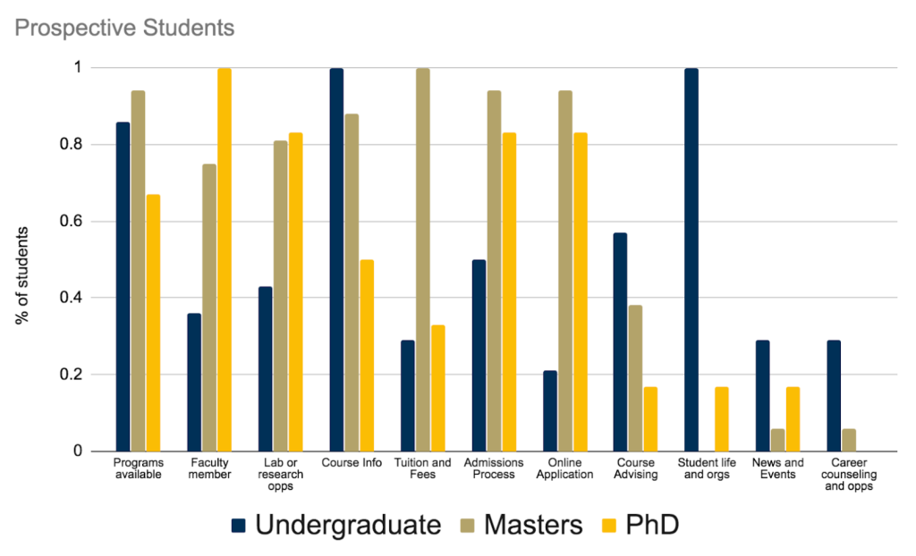
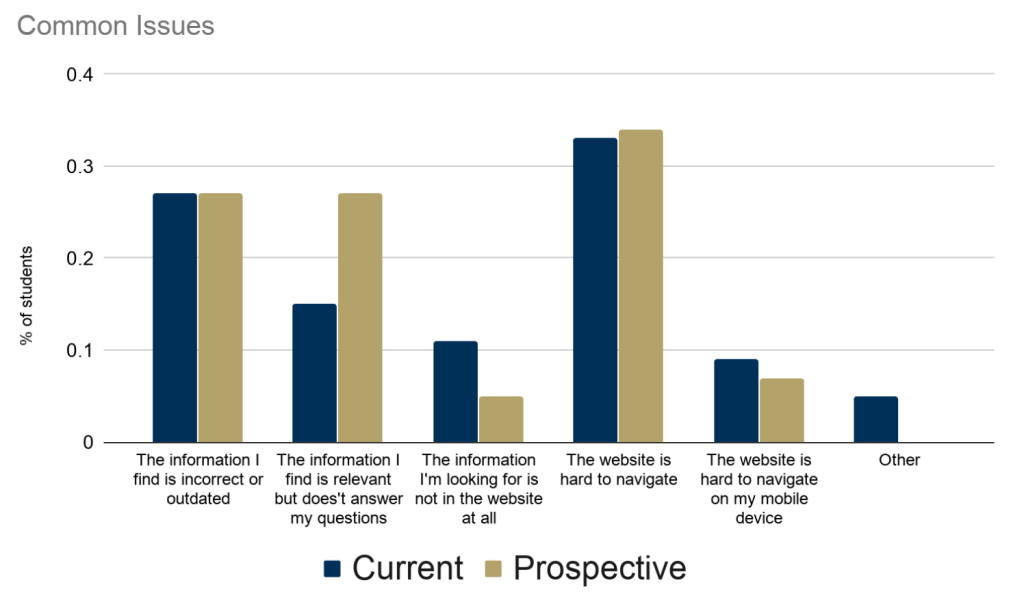
Current students and administration are familiar with the website's limitations. Its navigation and content are far more problematic for new and prospective students.
Best of all, the survey's findings were corroborated by our other methods — the same issues, opinions, and behaviors surfaced across activities, giving us confidence and focus.
III · Competitive analysis & heuristic evaluation
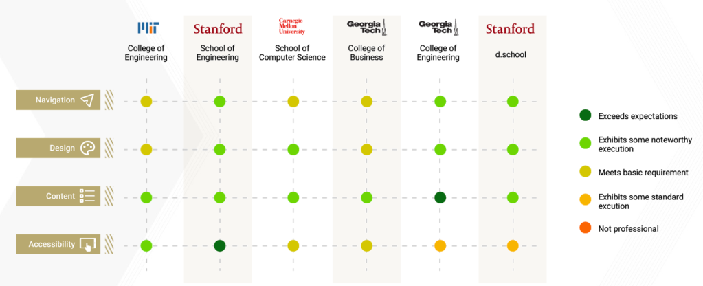
Much of the site's content, information architecture, and UI were outdated. We compared it to peer-institution sites using heuristics drawn from Abby Covert's Abby IA, Nielsen's usability heuristics, Schneiderman's 8 Golden Rules, and the W3C accessibility guidelines. This surfaced specific issues:
- The site is not responsive on mobile
- Navigation is unintuitive and messy due to an unclear structure
- Too much content that needs trimming and re-placing
- No clear style or branding guidelines
IV · Website analytics
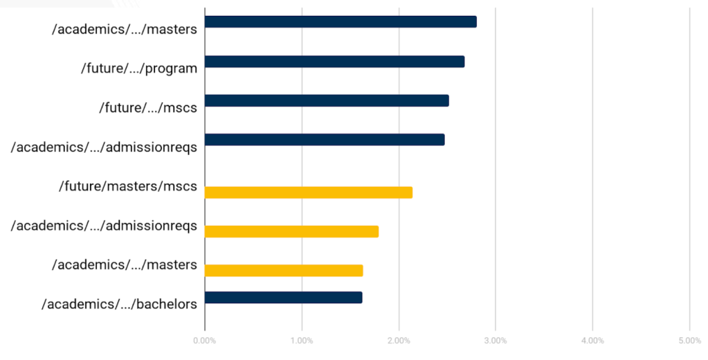
Analytics from the College gave us a quantitative grasp of traffic and behavior. Segmenting visitors showed which areas each group explored. We also found that visitors typically used Google to find a topic and jump straight to that page, rather than the site's internal search or click-through navigation — so we stressed SEO in our recommendations. Topics accessed on mobile were "quick" pages with little content; desktop visits were content-heavy and led to forms like the admissions application — a split that mirrored our survey results.
V · Hybrid card sorting
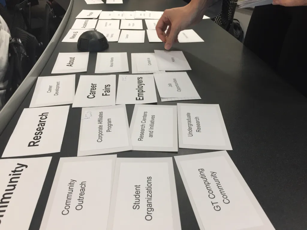
To build a baseline for a new information architecture, I led a card-sorting task. I pulled categories from the current global-nav tabs and cards from their dropdown items, met participants in person, and had them organize a shuffled deck as they saw fit — with the option to add or remove cards and categories, making it a hybrid sort. Participants thought aloud and explained each choice.
Analyzing category frequency, one change stood out: students wanted a clear distinction between resources for prospective and current students. That insight shaped the new IA we built next.
Information Architecture & Component-Based Design
- A new high-level sitemap of global and sub-navigational elements
- Components for select pages within two tabs of the new sitemap
- An interactive prototype of linked pages for user testing
Given the site's sheer volume of content and our limited timeframe, we couldn't redesign everything. We built the first two levels of the sitemap (global nav and its sub-elements), then deep-dove into two new tabs to test specific designs — built as reusable templates the College could adopt at handoff.
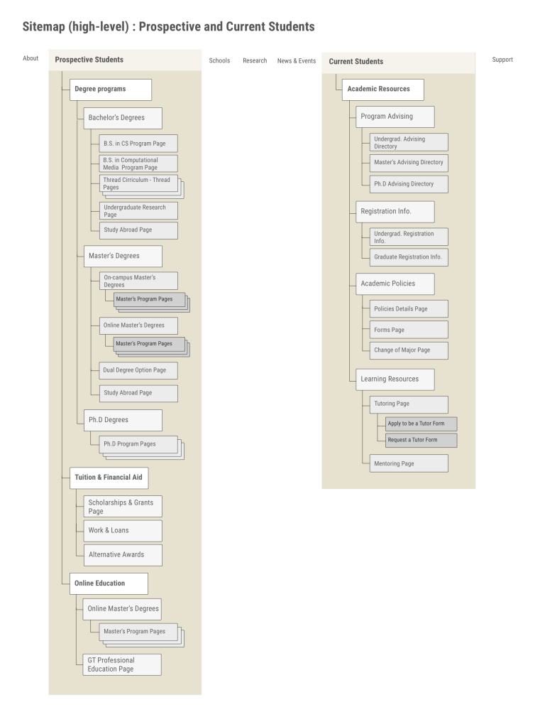
A new sitemap
Using the card-sort findings, we created a new global navigation with dedicated tabs for current and prospective students — the two tabs we focused on for the rest of the project.
Component-based design
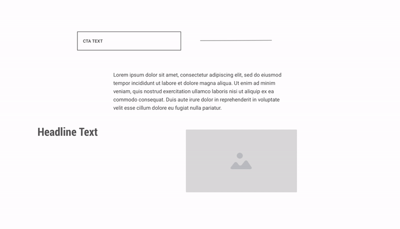
To avoid designing every page separately, we took inspiration from Brad Frost's Atomic Design, building components of text, media, and interactive elements like buttons. These templates stack together into full pages, and we delivered a components library suited to both desktop and mobile.
A solution for accessibility
Component-based design doubled as a systematic path to accessibility. Features like alt text and ARIA tags must be implemented programmatically — so if single components are coded with accessibility built in, the whole site inherits it as those components are reused.
Building pages
For the prototype, we took two candidate pages under the new "Current Students" and "Prospective Students" tabs and designed components with sample text, then asked peers to arrange the components in the order they'd want to see them — revealing in-page content hierarchies grounded in user feedback.
Prototype Evaluation
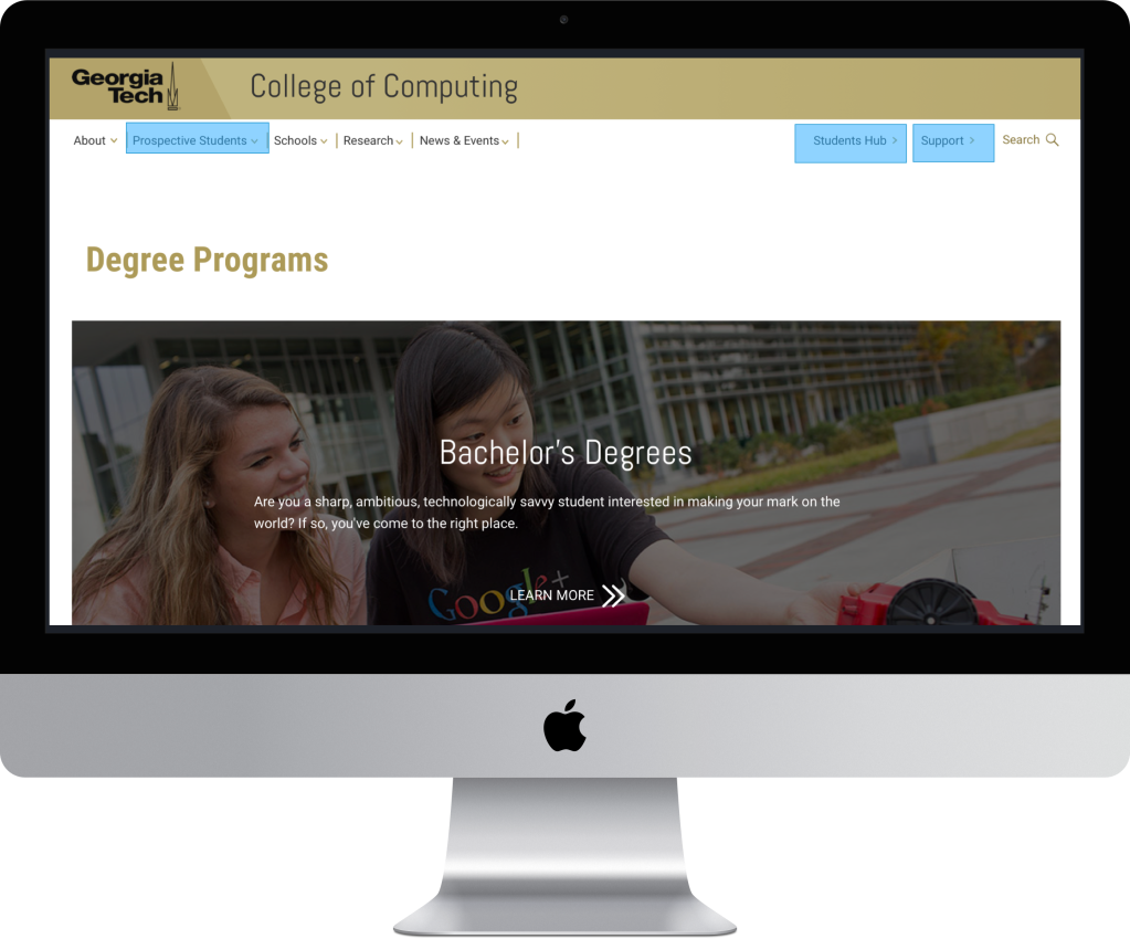
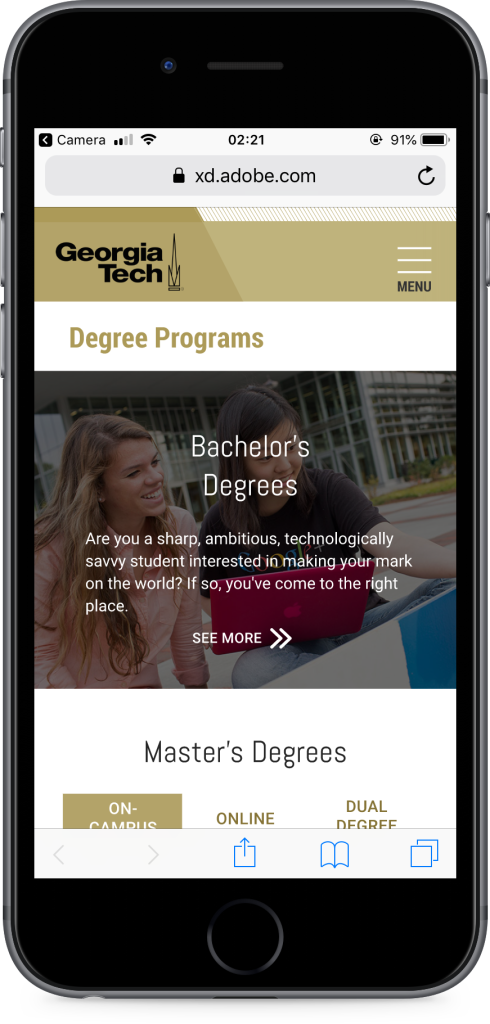
- A medium-fidelity prototype of newly designed, linked, clickable pages
- Improvements to navigation and design across desktop and mobile
- Qualitative feedback from experts on the new designs
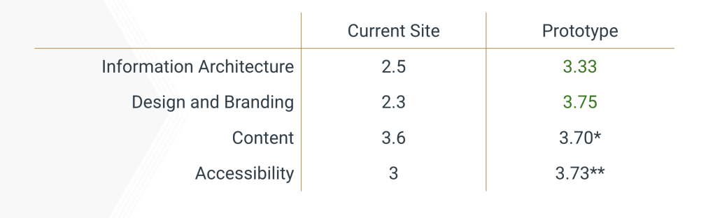
Heuristic evaluation by experts
I asked four experts to evaluate the new designs against the same heuristics from Phase I, giving us a quantitative read on whether the work had improved the original four focus areas. Comparing the two evaluations showed a distinct improvement in information architecture and design. Because the prototype used placeholder content and wasn't built programmatically, evaluators couldn't confidently review content or test accessibility features — I described where those would live, but the prototype itself didn't include alt text or screen-reader compatibility.
Testing on UserTesting.com
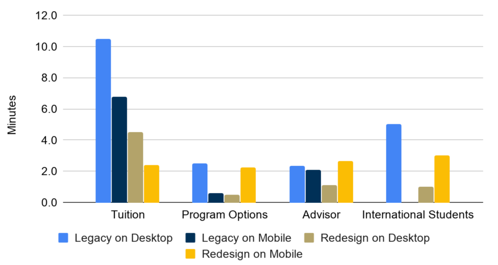
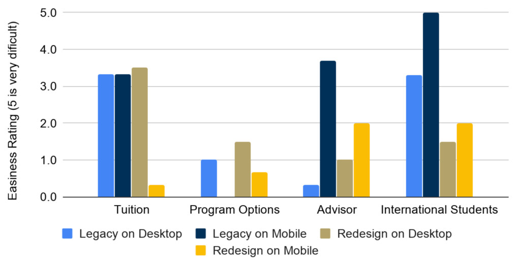
A teammate ran an A/B test between the legacy and redesigned sites across four conditions (legacy/redesigned × desktop/mobile). Participants found specific topics while being timed, then answered questions about the experience. Across 11 participants, the redesign showed a general decrease in time on task and increase in ease of use.
→ Final recommendations
In our final presentation to the College of Computing, we gave specific recommendations for each focus area.
Information architecture
- Continue developing the sitemap
- Offer multiple paths to content, but keep a consistent URL format to improve SEO
- Confirm subsections of the sitemap with users
Content
- Adopt a content strategy — add content concisely and intentionally
- Combine content strategy with user research by asking users to prioritize content
- Give external sources (labs, centers) templates to maintain consistency
- Link to external resources to minimize broken links and upkeep
Design
- Parallelize mobile and desktop design — mobile shouldn't just be a shrunken desktop
- Use component-based design to minimize effort while keeping a consistent style
Accessibility
- Add alt text to the markup for all images
- Provide transcripts for all audio/visual content
- Don't rely on color or highlight alone to differentiate content
- Keep a contrast ratio of at least 4.5:1 between text, images, and background
- Make interactive elements operable by mouse or keyboard
- Order content meaningfully and hierarchically to reduce time on task with screen readers