Sous Chef
User Researcher · a voice-enabled kitchen order manager
For my last computer science class, I took a course on UI Design. Each semester the staff picks a platform students must build on — mine was Amazon's Alexa, so our project had to include some kind of voice interaction.
Within my group we split into one designer, two engineers, and one user researcher (me). Those roles blurred as the semester went on, and by the end we were all designing and coding.
01 Ideation
The brief was sparse, so we could build almost anything. We ran an IDEO-style brainstorm, generated about 50 ideas, and grouped them into categories like academic, fitness, and food. We landed on food — a recipe app to guide users through cooking.
Unfortunately, that exact idea turned out to be the next homework assignment. Back to the drawing board: we wanted to stay in food, but recipe and cooking-aid apps were already common, so we needed a different angle. Inspired by teammates who all worked at a tea shop near campus, we pivoted from recipe instruction to restaurant order management. Sous Chef was born.
02 Problem space & MVP
Sous Chef set out to address two concerns in restaurant kitchens: sanitary conditions and efficiency. Many kitchens still run on paper — chefs touch receipts, printers, and bells to mark the start and end of an order. Voice capabilities let us minimize contact with anything that isn't food, taking advantage of the hands-free nature of the technology.
That fed directly into efficiency: less time washing hands, and a way to look across orders to spot redundancies. A common complaint from my teammates' tea shop was that, without a good way to see all incoming orders, they'd make the same drink multiple times — washing blenders and utensils in between — instead of batching it.
- Display orders on the GUI as they come in
- Start and finish orders through either touch or voice
- Show a summary of the order queue via voice command
03 User research
We began with a competitive analysis and interviews. The analysis showed that food and restaurant apps clustered around recipes or finance/business management — nothing aimed at order management, so our idea was still novel in a saturated industry.
We interviewed three restaurant cooks, starting broad (what they liked and disliked about the job) before honing in on the ordering process — e.g. "How do you feel about your current system of receiving orders from the cashier and signaling that orders are complete?" We condensed the findings into a ranked list:
- Group identical orders quickly to batch food rather than make them individually
- Quickly see which item is next in the queue, or already made
- Be reminded of orders if forgotten
- Quickly filter the order list and see everything in the queue
- Be notified of the newest order without interrupting current work
Our interviews surfaced an issue we hadn't considered: language barriers. Cooks from other cultures can struggle to communicate with co-workers — an app driven by simple English commands could smooth the whole cooking-and-delivery process.
Low-fi prototype & usability testing
Combining the user needs with our goals, we built low-fidelity wireframes in Figma. To ease the transition from paper to virtual orders, we mimicked the way restaurant slips line up in a kitchen — a horizontal row of small squares showing order numbers and items. Users could start an order, mark it complete, undo changes, request a queue summary, and see completed orders. Starting an order (by tapping "Start" or saying "Start order number…") moved its slip to the front and outlined it in blue; the queue summary was voice-only.
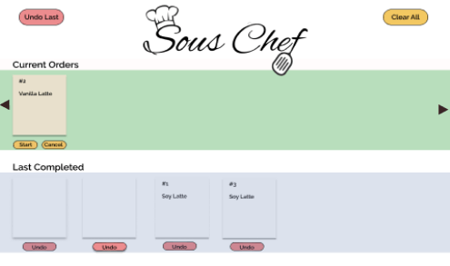
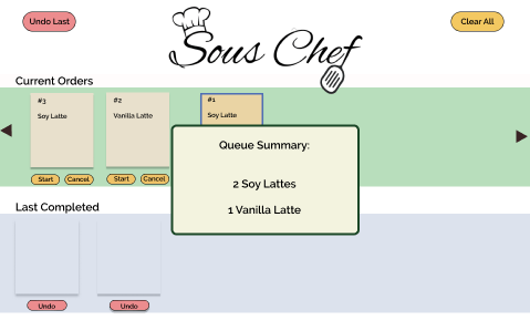
While the engineers started coding the voice UI, I ran usability tests with two friends who'd worked in restaurants, asking each to start an order, request a queue summary, and complete the order. I simulated functionality with multiple frames shown as users tapped and spoke commands, then asked closing questions.
The queue summary was hardest for both. Although they could use voice or touch, they defaulted to touch — having to speak mid-tapping felt awkward against such a low-fidelity prototype. Still, both said voice would be genuinely useful in a real kitchen. Design feedback was contradictory: one liked the colors and queue organization; the other wanted the colors and "in progress" treatment changed.
A functional web app & expert reviews
We folded that feedback into a functional web app with adjusted colors and a working voice UI. Orders in progress were now marked green, and we added delete confirmations and "close" buttons to exit pop-ups like the queue summary.
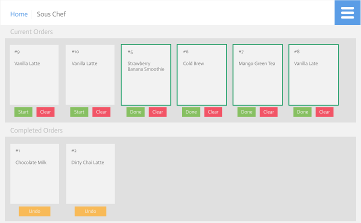
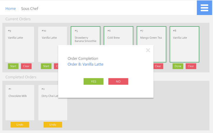
To test it, we ran in-class expert reviews with two other groups — explaining the app, then letting them explore and give feedback. They praised the simplicity (all functionality on one screen) and the fact that it solved a real problem outside the classroom. Suggestions focused on decluttering: remove some buttons, move notifications to the side so they don't block orders, and make the "Completed Orders" bar collapsible. Reviewers also noted we had no way to place orders, and would eventually need a diner- or cashier-facing UI.
The showcase build
The final iteration, demoed at our end-of-semester showcase, addressed that feedback. We added a basic input screen where diners could place orders, which uploaded to a database the main page pulled from. As a cook changed an order's status to "in progress" then "complete," the database updated too — which also made the demo interactive: audience members could add their own orders and watch them move from start to finish. We moved notifications into the bottom corner and cut the number of buttons; the completed-orders list became collapsible so chefs only see what's incomplete.
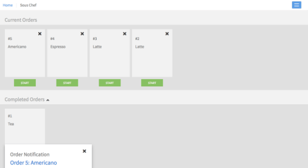
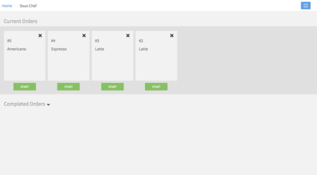
Back against our three goals and five user needs, Sous Chef delivered: all orders visible with live status, touch and voice interaction, a summary to catch redundancies, and notifications that don't disrupt the work. Exactly what we set out to build.